02 Apr Seema Gujral Flagship Store Is Quiet Luxury In Minimal Elegant Design | RENESĀ Architecture Design Interiors Studio
The Seema Gujral flagship store is quiet luxury in minimal elegant design of the navigational common spaces. It opens into distinctively designed sections, each identified by the SG collection they display and the design philosophy they showcase.
Seema Gujral Flagship Store Is Quiet Luxury In Minimal Elegant Design | RENESĀ Architecture Design Interiors Studio
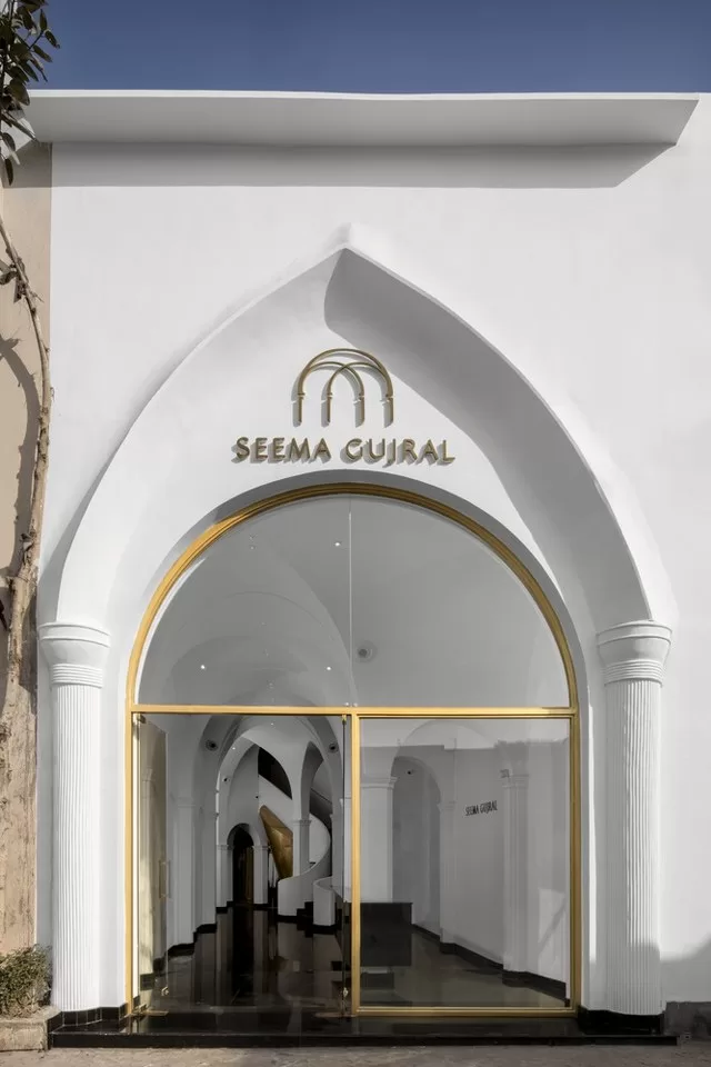
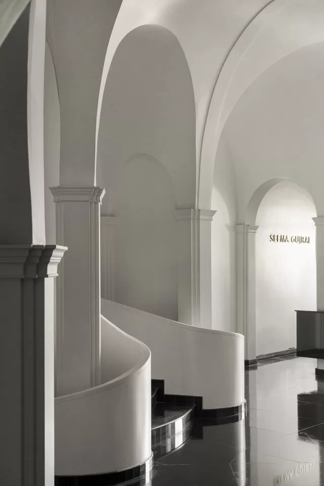
This division of space through visual elements, along with varied scales and the funneled circulation, creates easy navigation even for the first-time user, letting the emotions the to-be bride and groom carry for their special day continue to remain at the center stage.
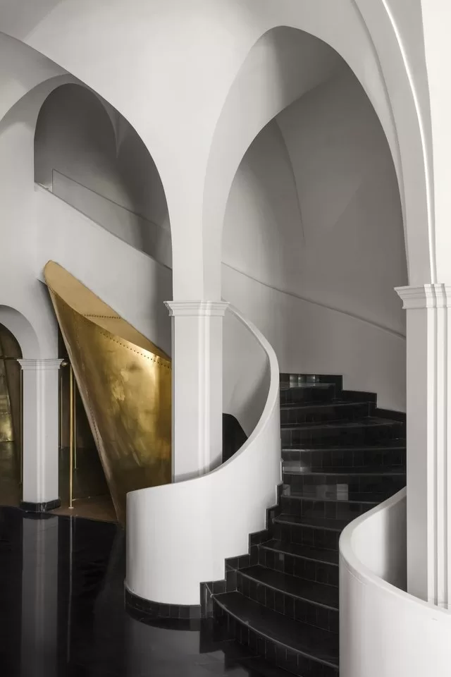
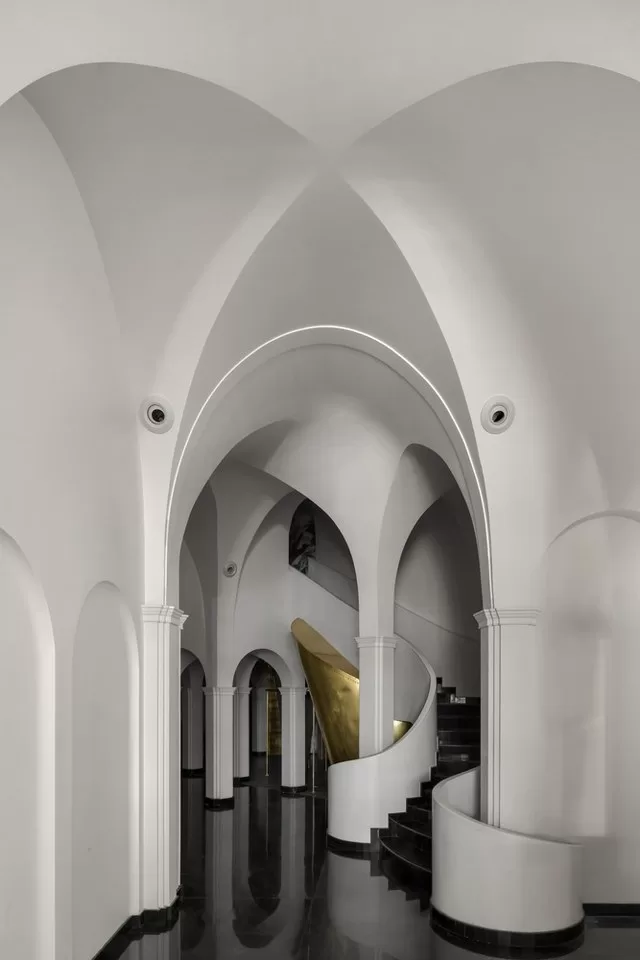
While the client envisioned a space to bring tradition and modernity together just like her pieces, team Renesa brought this vision to life by reflecting the conceived visuals and giving them customer-focused design sensibilities.
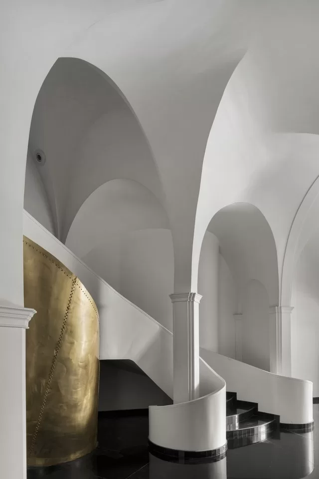
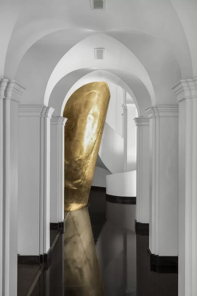
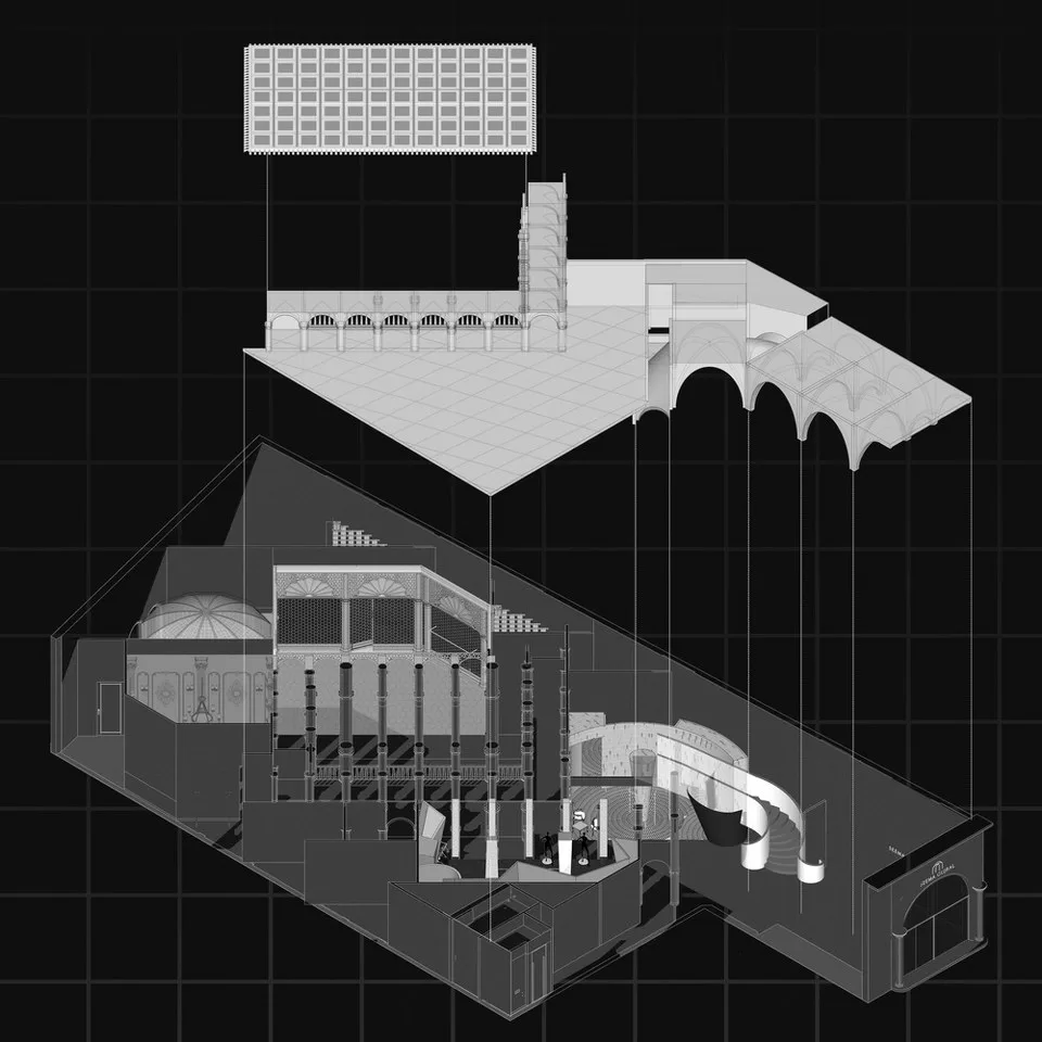
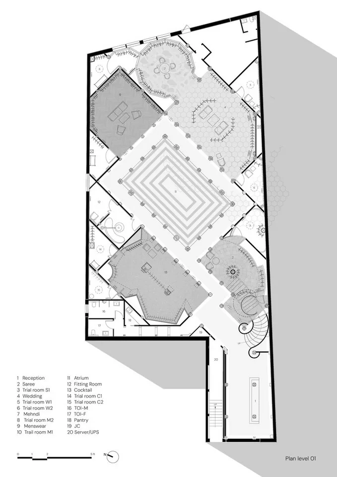
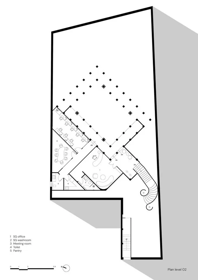
The store covers an area of 7500 sqft on the public ground floor and an area of 1500 sqft on the mezzanine floor that harbors the private office spaces and allows for double height volume on the ground floor.
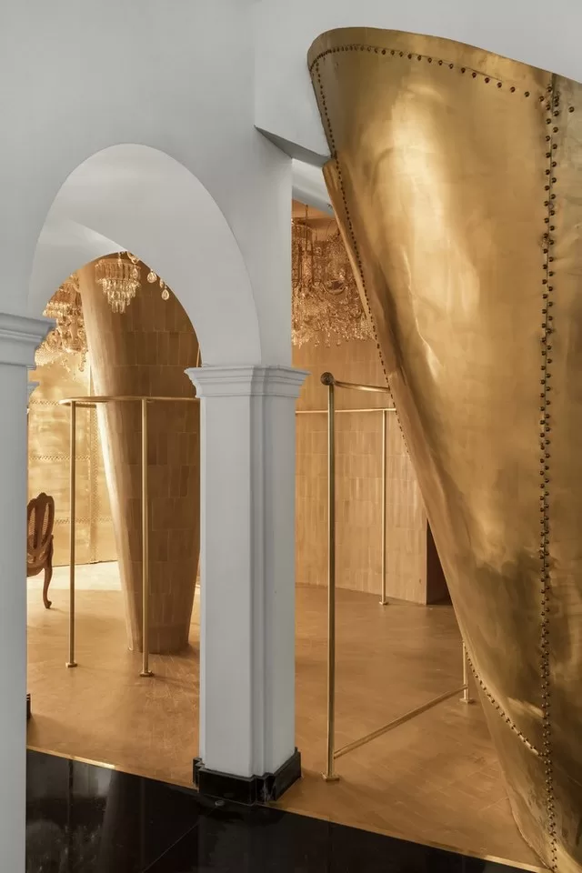
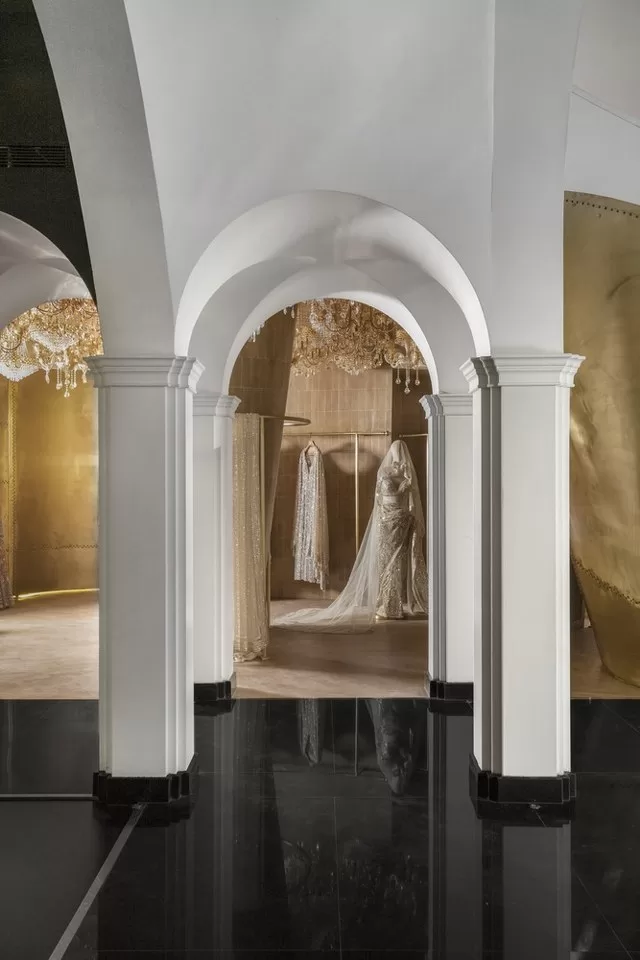
Seema Gujral’s pieces are set apart from the ordinary through their intricate details that reflect the beauty of Indian traditions while also incorporating the modern perspective.
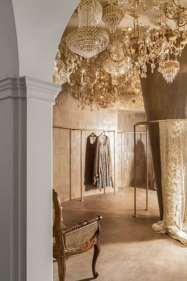
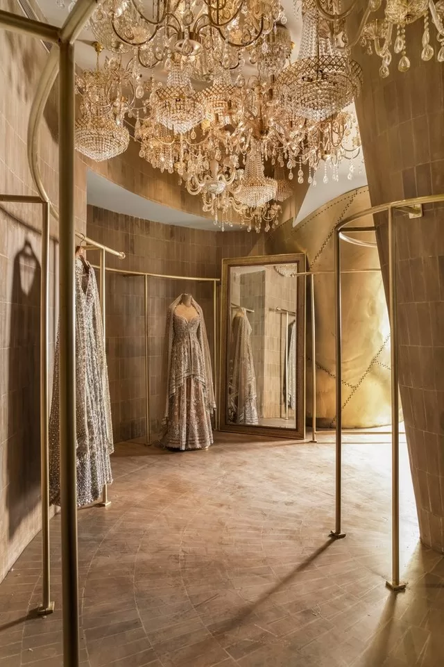
The quiet luxury created in Seema Gujral’s ensembles extends itself to its environment at this flagship store.
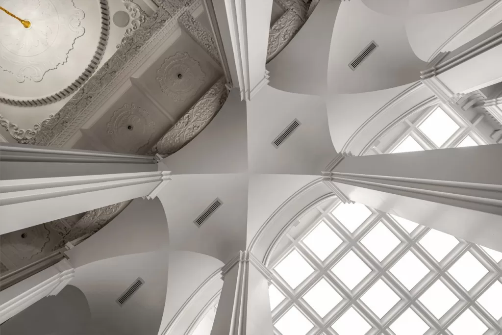
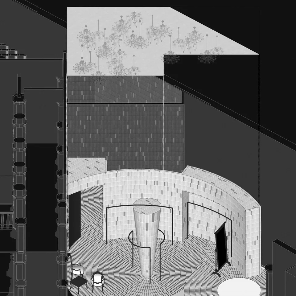
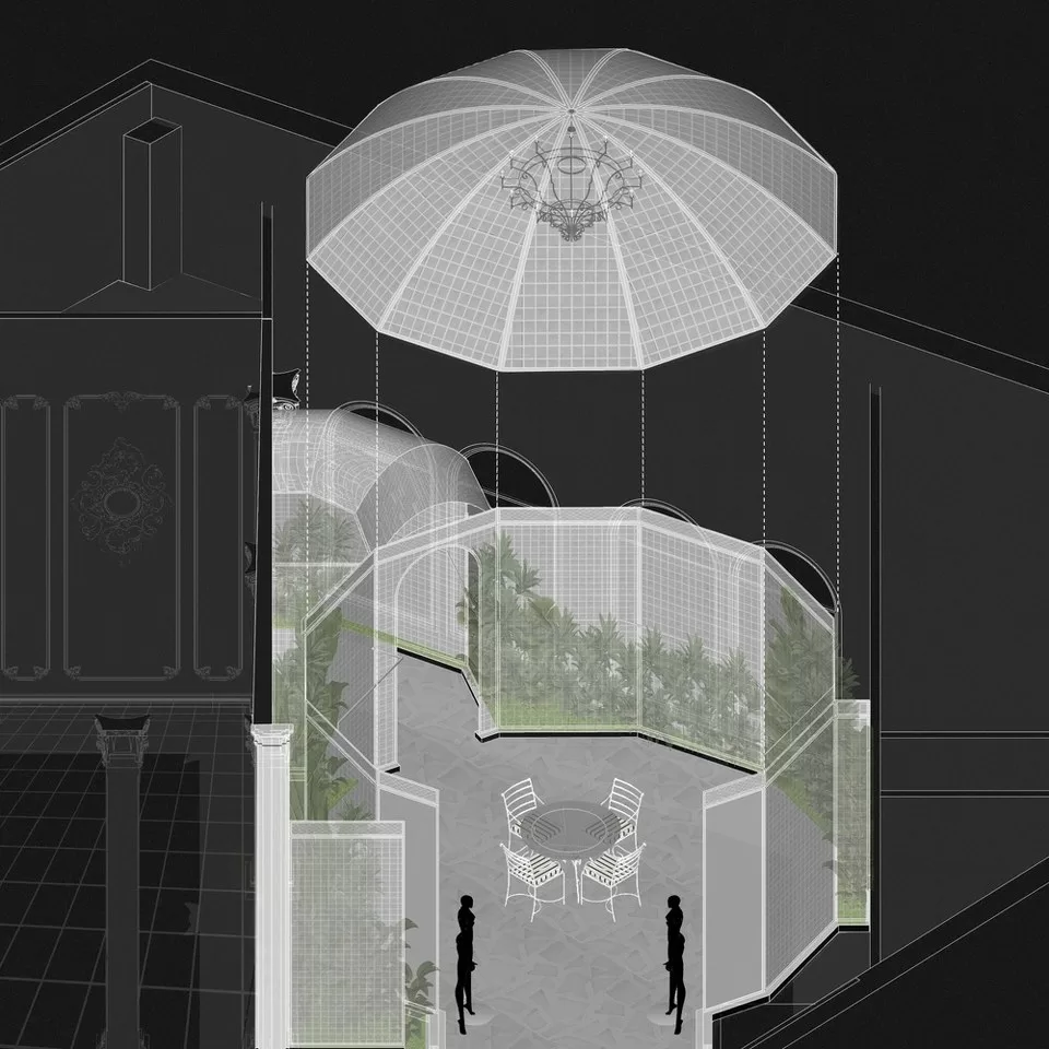
Renesa has tied the traditional spatial design of a voluminous courtyard through closely knit, humble, yet detail-rich alleys that open into five different sections, each based on a unique Seema Gujral collection.
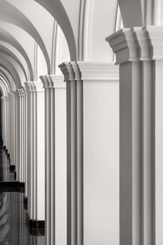
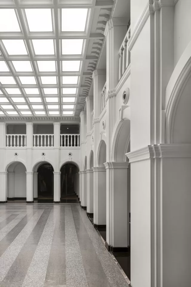
The collection inspires the habitat which in turn puts the spotlight on these grand pieces. The harmony achieved between the two is reflective of Renesa’s commitment to brand identity.
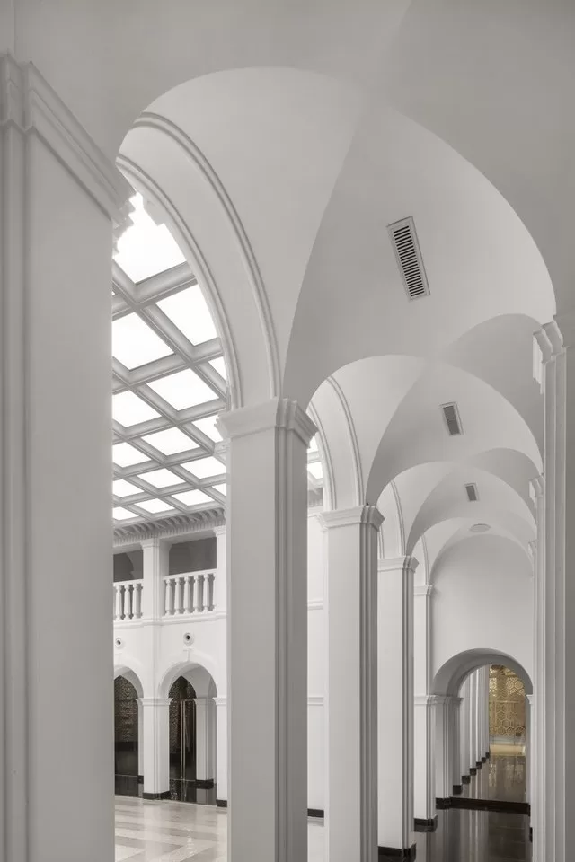
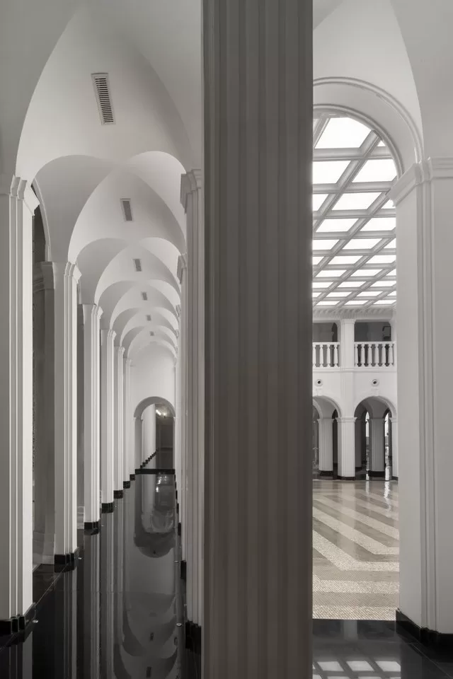
As the spectator enters, they are greeted by clean lines of black and white, and within it pops a magnificent brass funneled feature, herald of the rich visual treat to follow. Details of brass elements introduce themselves throughout the store, contributing to cohesion within varied themes.
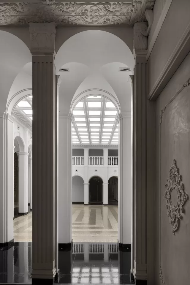
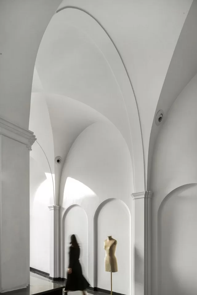
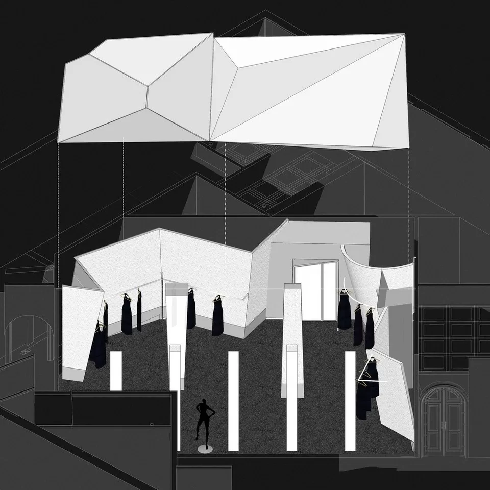
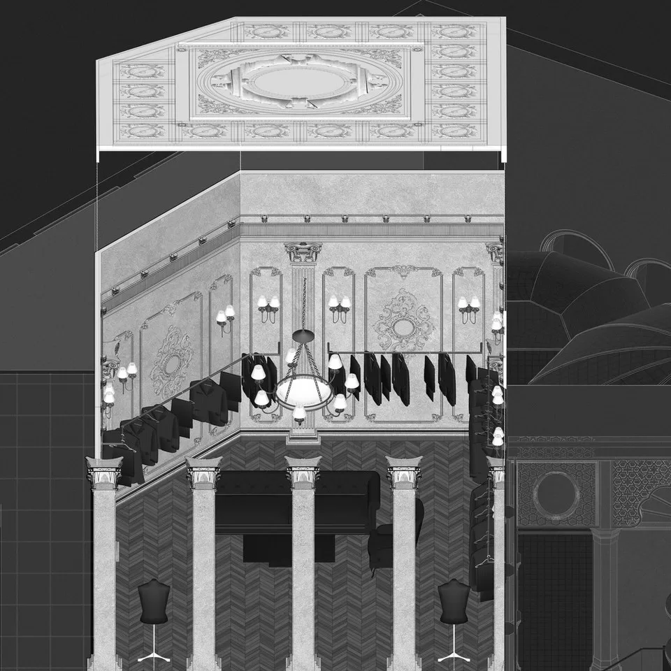
Further, pendentives of grand scales tie the geometric ceiling with the Parisian, giving a subtle nod to Seema Gujral’s own philosophy of transitional design. Battered metal sheets revolt against the norm, abandoning the orthogonality for a more dynamic askew geometry in the cocktail section.
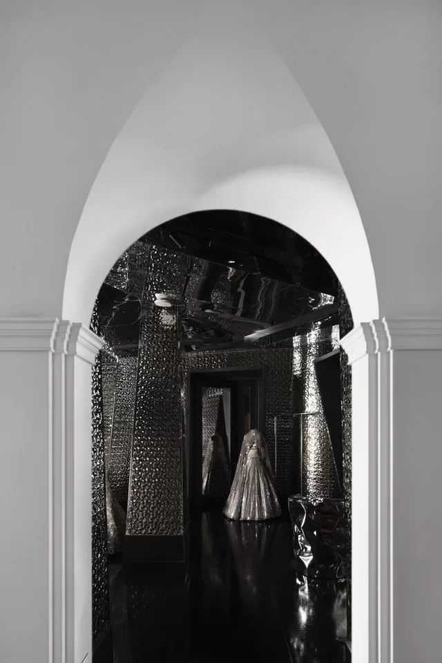
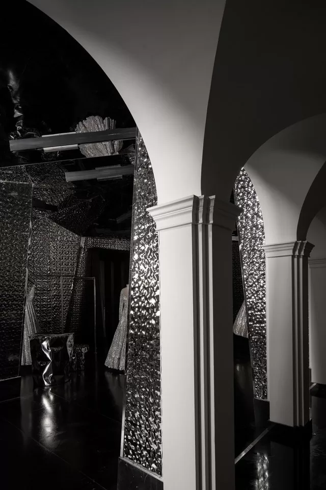
An earthy theme elsewhere gives another perspective, another lap for the like ensembles to be held and embraced in.
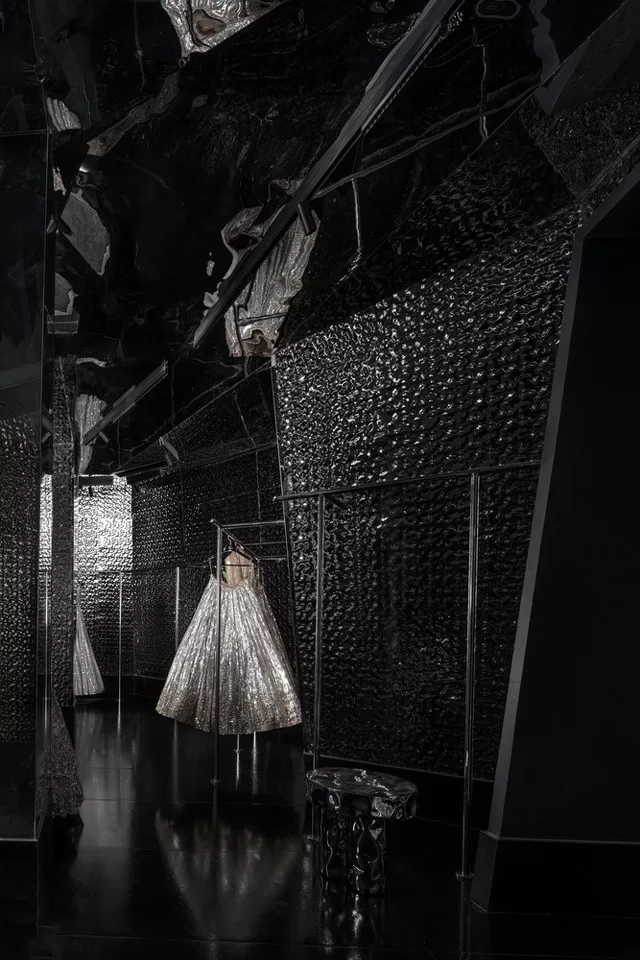
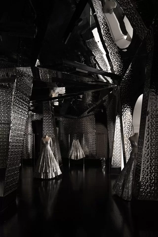
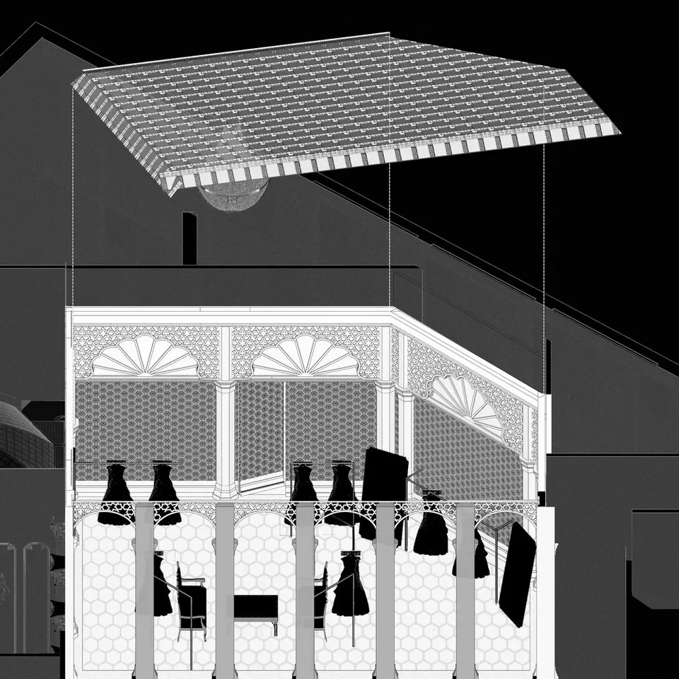
The brand inspires the theme of the store, putting a modern lens on traditional Indian aesthetics. The earthy elements of the saree section, avant-garde metallic sheets of the cocktail section, the Parisian charm of the men’s section, and the grid mesh of the Haldi section bind themselves at the focus of a grand double-height courtyard that forms the stage for the Hindu style Altar.
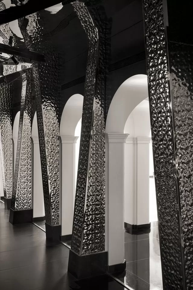
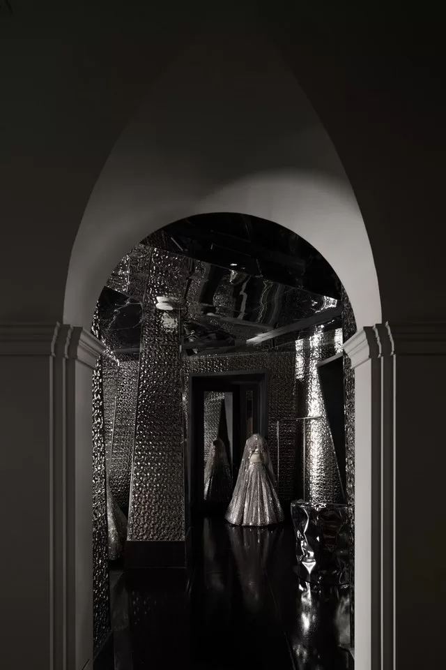
The theme tributes to a traditional Indian wedding while acknowledging the zest of a modern couple. Seema Gujral’s internationally recognized ensembles and Renesa’s globally acclaimed design acumen have synergized into an encapsulating space with this project, ensuring that while tradition is the key highlight, innovation sets it apart.
Fact File
Designed by: RENESĀ Architecture Design Interiors Studio
Project Type: Retail Interior Design
Project Name: Seema Gujral Flagship Store
Location: New Delhi, India
Year Built: 2024
Project Size: 96875 Sq.ft
Principal Architect: Sanchit Arora
Founder: Sanjay Arora
Senior Architects: Aayush Misra, Mallika Khanna
Architects: Miljot Singh & Ishita Kukreja
Branding: Shruti Narayaswami
Text: Anqa Ahmed
Clients: Seema Gujral
Photograph Courtesy: Avesh Gaur
Source: Archdaily

Firm’s Website Link: RENESĀ Architecture Design Interiors Studio
The Firm’s Instagram Link: RENESĀ Architecture Design Interiors Studio
Firm’s Facebook Link: RENESĀ Architecture Design Interiors Studio
For Similar Project >>> A Fashion Brand Store That Celebrates Art In Spirit
The post Seema Gujral Flagship Store Is Quiet Luxury In Minimal Elegant Design | RENESĀ Architecture Design Interiors Studio appeared first on The Architects Diary.


No Comments